Perfect Properties
An AI assisted property search experience that helps first-time investors make confident, informed decisions.
About Project
Student project
Timeline
3 months
Tools
Figma, ChatGPT, Balsamiq, Lysnna
Role
Documentation, UX/UI Design, Wireframing, Preference Testing, Prototype


Framing the problem
First-time property investors struggle to make decisions because existing platforms overload them with complex data

First time property investors want to make smart decisions but property searches are often overwhelming and leave people with unanswered questions . Perfect Properties reimagines the process through a user-first lens with clean design, AI support and an interactive map for a visual search experience.
Vague design brief
I used ChatGPT to gain insight, fast.

I was given a design brief of a 'blue/green' colour palette, a 'smart' and 'clean' style and one persona who was a first time property investor 'always on the go. I knew this wasn't enough data to craft a successful design. To compensate for limited data, I ran rapid, structured research using Perplexity and Chat GPT and engineered my research prompts using the CARE framework, Context, Ask, Rules, Example as this is recommended by Neilson Norman.
Key findings
AI synthesis defined project goals
I completed heuristic evaluations on competitor products and looked for trending pain points in their user reviews before using ChatGPT to synthesise all research data gathered into core project goals.
Responsive 'mobile first' design
Investment education
Personalisation
Comprehensive property insights
Save and revisit property listings
Visual search aids
Separating discovery from education
Balancing function and form on mobile UI

I sketched out user flows in detail, I realised that property searches were complex, they demanded a broad scope of information from the user and squeezing that into mobile design was trickier than I had anticipated.
My first instinct was to combine search results and educational content in the same view, so first-time investors could make decisions without leaving the page. In practice it created exactly the problem I was trying to solve, too much information, not enough clarity. This led me to design two separate modes entirely.
I used an AI chatbot to bridge the gap between user needs

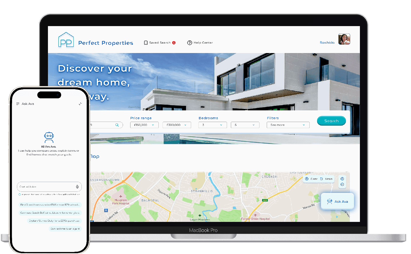
Homepage
The homepage surfaces what returning users need most, saved search updates and quick access to their four key tasks. Keeping navigation task-focused means users aren't confronted with information before they've decided what they're looking for.

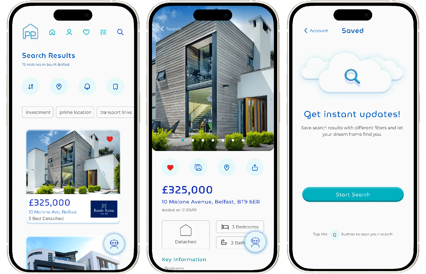
Search Results
Keyword quick filters were earlier identified as a gap in the market. They give users a faster route to relevant results without opening a full filter panel. Ava sits persistently in the corner so users who want guidance can access it, without disrupting users who don't.
Designing AI around trust
What does a good AI chatbot look like?
Users need both nuanced and comprehensive information to support their property investment descicion, making an AI chatbot the perfect tool. Many people remain skeptical around AI, or have never used it before, so keeping my AI design simple and user friendly was paramount.


Complex filters
73% preference for tabbed filters over mega menus
Research indicated strong desktop usage for property platforms, making filter usability a high priority. I ran a low-fidelity preference test in Lyssna to validate my approach before investing time in high-fidelity design.
Before
Mega Menu Balsamiq sketch
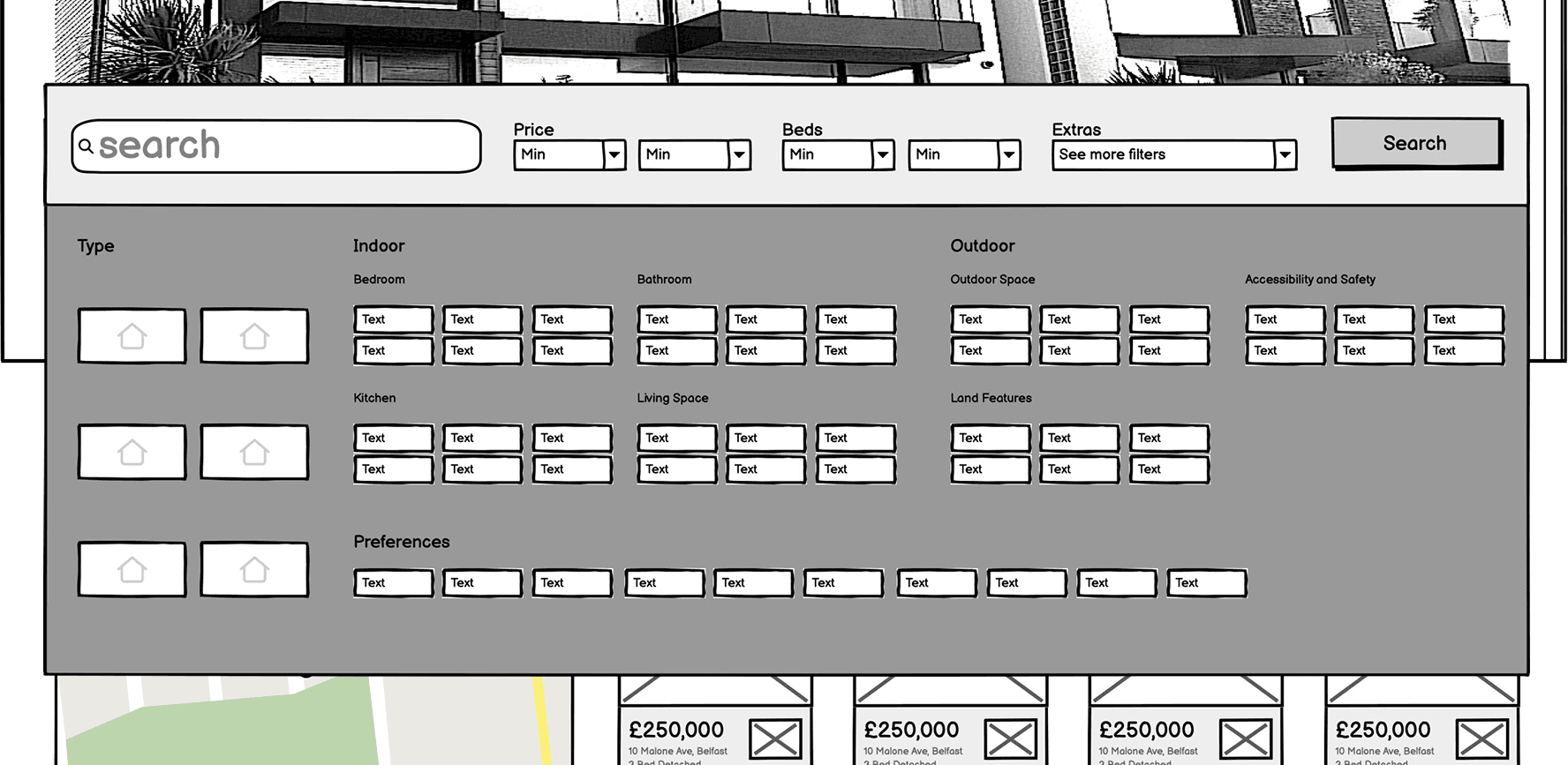
After
Tabbed Menu High-Fidelity Mock-up

Crafting the design system
Building my own components

I created a light weight design system for Perfect Properties from scratch to develop my skills as a UI designer. Making my own icons and components was fun! Although using existing design systems is faster, I'm happy to be able to create custom pieces where necessary.
Final Design
Perfect Properties - Discover your dream home your way
Perfect Properties was designed to give first-time investors the tools to search visually, make investment descions with clarity as well as have the ability to save criteria and revisit listings. Each feature contributes to a smoother, more informed experience, turning complex decisions into confident action.


Responsive 'mobile first' design
Visual search aids


Comprehensive property insights
Save and revisit property listings
Integrated AI assistance provides personalised guidance, explains key property terms, and helps compare areas with real-time insights. This creates a cohesive experience where users can access expert-level knowledge instantly.
Investment education
Personalisation
Key Takeaways
Designing AI is about trust
Clear boundaries, gentle language, and visual restraint matter more than intelligence alone. Skepticism must be catered for.
Clarity beats feature density
Adding more steps to a user flow isn't a always bad thing if it reduces cognitive load. Users want clarity, not just speedy access.
AI accelerates the design process
AI tools will revolutionise how designers work, however human context and validation is still required. Prompt engineering and appropriate tool selection is vital for high quality output.